Thursday, 29 December 2011
Monday, 12 December 2011
Thursday, 8 December 2011
Wednesday, 7 December 2011
Tuesday, 6 December 2011
Monday, 28 November 2011
Sunday, 20 November 2011
Wednesday, 16 November 2011
Tuesday, 15 November 2011
Monday, 14 November 2011
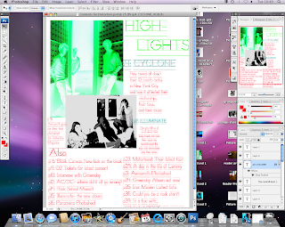
Contents Page: Progression
Transforming 'CYCLONE' to make it bigger and more pronounced and also moving it above the description to make it the most important feature.
Blue and red font, same as used on front cover, gives off a distorted effect, so coi-incides with the magazine name.
Black and white photo contrasts the fluorescant green photo, and makes them stand out as the two highlights in the magazine. Large, clear font for p4 and p17, to also make it stand out to the reader
Finished product, having moved the text/images into a good position to make the page easy to read and identify the key points. the use of the colours of bright greens, blues and reds contrast eachother well and give off a distorted image, so they co-incide with the magazine name
Wednesday, 9 November 2011
Music Magazine Powerpoint Notes
- Readers read magazines fro top left to bottom right
-Refer to other forms of media (films/TV)
- Salience is using image size to reflect importance
- Sentence functions are important to how a reader thinks
-Refer to other forms of media (films/TV)
- Salience is using image size to reflect importance
- Sentence functions are important to how a reader thinks
Sunday, 6 November 2011
Second Photoshoot for Rock Magazine
Long shot, different colour levels and slightly angled
Long shot, different levels
Wide-shot, shows background of photo
Colour shows off details of models, contrast of heights/eyelines etc looks good
Taken at Southend seafront 10:30pm
Wednesday, 2 November 2011
Tuesday, 1 November 2011
Youth Subculture and Media Press History Presentations
Points I was not aware of in the presentations:
Youth Subculture:
1) The values of a youth subculture: Attitude, conformity and rivalry
2) There are different views on what makes subcultures different from each other, e.g. CCCS believes they are all similar as they all follow a sense of rebellion from mainstream, but Grant McCracken believes that each subculture has its own beliefs and origins which cannot be generalized
3) There isn't a defined mainstream any more, there are too many subcultures and streams to name one as 'mainstream'
History of the Music Press:
1) In the mid-70s there was a split in the music press between 'Music Journalism' and 'Political Journalism' focusing on the politics and beliefs of artists
2)In the late 70s, style was more important than content in music magazines
3) Fanzines were first produced in the 80s, they looked very handmade but they inspired a great wave of interest in journalism, writing and drawing
Monday, 31 October 2011
Flatplans

This is the flatplan for my Contents Page. As you can see I have put the main highlights in boxes at the top of the page so that they are the first thing you see when you see the page. I have seen how in other magazines, such as Rocksound, highlights of the magazine are in the contents with their page numbers highlighted to gain interest. This is how I have set out mine, as I think it will be interesting and attract my target audience of 16-19 year olds. The rest of the contents will be underneath the highlights in a spread out and page-numbered layout with language suitable to the Rock genre. The colour scheme will be the same as on the front cover, in darker reds, blues and purples.
This is the flatplan for my double-page spread. The Band name, which I still need to decide upon will be in large brightly coloured font at the top and in the middle of the two pages, so that readers know straight away who the article is about. I will have numerous pictures of the band across the page spread out and randomly placed, to add a sense of rebellion and non-conforming to the rules. In some, they will be smiling and in others looking serious to add contrast. I will use a relevant font for the text of the article and black writing over a white background, with some sort of photo-shop effect to create a sense of contrast and mystery.
This is the flatplan for my front cover. The colour scheme will be dark, but bright colours, such as red, blue and purples which will stand out and contrast eachother. The photo I will use for the cover will take up most of the page and will show the whole band staring at the camera. There will be colourless boxes around the bottom of the page to advertise other parts of the article and to advertise music lessons/instruments that will appeal to the target audience of 16-19 year olds. The logo for the magazine will be a guitar and two drumsticks crossed over eachother, as this is what my focus group thought would comply best with the genre of the magazine and will attract my target audience of rock lovers.
Sunday, 30 October 2011
Preliminary Photos for Magazine
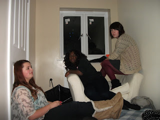
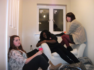
These are the first set of photos for my music magazine. They were taken in a house in Maldon, Essex on Saturday 29th October 2011. I chose to set the room up like a squat, to give off the sense of teenage rebellion, and the pale colours of the background contrast to the darker clothing of the models.
This photo shows the band looking more sinister and mystical. They are still in ascending order of height which is interesting, and they look slightly more rebellious here as their faces are sullen and serious, which fits in well with the rock genre.
This photo shows some contrast within the band, as Nikki is laughing while Mia and Emily are serious. The symettry of 'serious, laughing, serious' is interesting, and the band's positions have changed slightly as they are more hunched up as though they are hiding. This adds a sense of rebellion and intrigue to the photo.
This photo is a close up of the band hiding behind Nikki. I intend to photoshop out Katie, so that the three main band members are visible. This photo shows two of the band hiding behind Nikki, which sends out the message that Nikki is the most upfront. This also shows the secretive nature of Mia and Emily, which adds a sense of mystery and intrigue. The umbrella shielding them from the light adds undertones of darkness and fits in well with the rock genre and rebellion.
Sunday, 23 October 2011
Magazine Name Brainstorm
I brainstormed different names that I could use for my Rock Magazine, and my initial ideas were 'CRUSH', 'Phenomenon' and 'Firefight'. I took inspiration for these names by researching songs and artists in the Rock genre. I decided I liked 'CRUSH' the best, as it sounds rebellious and interesting, and it would make people sit up and notice, as it doesn't give away directly what the magazine is about or what genre it is, which also adds a sense of intrigue. I then moved on to research some specific guitar terminology, taking inspiration from the 'Kerrang' magazine which uses onomatopoeia of the sound a guitar strum makes to attract its target audiences. I liked '3rd Bridge' (a style of guitar playing) and 'Distortion' (an amplifying method), as these would both attract the initial audience of Rock-lovers in their late teens as they would understand the terminology as being specific to a Rock Magazine. Also, these names would attract teenagers with a more wider interest in music, as they would be interested to find out which genre of magazine the name referred to. I have narrowed the name down to three choices of 'CRUSH', 'Distortion' and '3rd Bridge), and before I make my final decision I shall ask people in my target audiences of teenagers and young people, to see which name they prefer.
Thursday, 20 October 2011
Focus Group: Teenagers between the ages of 16 and 19 who like Rock music.
1) Megan
Age:16
Education: SHSG, SEC
Favorite Band: Paramore
Favorite Color: Violet
Very interested in metal/rock music. Shops at places like Utopia, H&M, Dead Glam and Mixtures. Listens to Metal/Rock/Alternative regularly (at least once a day) in her home, while out and about (on her IPod), uses ITunes to download albums such as Iron Maiden (The Final Frontier), Motorhead (Kiss of Death) and Aerosmith (Just Push Play). Also interested in Alternative Rock, including Bjork and Radiohead, which she listens to a few times a week on average. Suitable as a member of my focus group as she has a wide, varied interest in all types of rock, and so will be able to give valid advice on my magazine

2) Harriet
Age: 16
Education: SHSG, SHSB
Favorite Band: Queen
Favorite Color: Silver
Interested in Metal music, shops at Mixtures, H&M and Argoth. Listens to Metal Music regularly (3-4 times weekly), usually in her bedroom or her home, buys new albums from places such as HMV and Virgin Megastore, also uses ITunes to download albums such as AC/DC (Stiff Upper Lip) and Grand Funk Railroad (Rock 'n' Roll Soul). Also has an interest in Pop Music, such as artists like Taylor Swift and Kelly Clarkson. Suitable as a member of my focus group, as she has a wide interest in music in general, with a specific interest in the Metal genre
3) Nikki
Age: 16
Education: SHSG, SHSG SF
Favorite Band: Tokio Hotel
Favorite Color: Red
Interested mainly in Rock as a whole, with particular interest in Pop/Rock and Metal/Rock Crossovers. Shops at Mixtures, H&M and Utopia. Listens to Rock daily, usually in her own personal space (her room, on her ipod). Uses ITunes and YouTube to download albums, such as Lost Prophets (Liberation Transmission) and Greenday (American Idiot). Has a wide interest in music, is eclectic in her taste, likes Punk Rock, Pop and Metal, which are the main genres she listens to regularly. Suitable as a member of my focus group as she most favors Metal/Rock, but has an interest in other forms of Rock, and other genres which I could take inspiration from

4) Chris
Age: 19
Education: KES, KES SF, Works at Primark
Favorite Band: Paramore
Favorite Color: Black
Interested in Rock music and alternative. Shops at H&M, Topman, Utopia and Next for Men. Listens to Rock 2-3 times weekly, and listens to Metal and Punk Rock 4-5 times weekly, usually while working at home or in his personal space (i.e. his bedroom). Uses ITunes to download albums, and listens to MTV daily. Also interested in rap artists such as Jay-Z (American Gangster), Beyonce (I am... Sasha Fierce), R.Kelly (Love Letter) and Big L (The Big Picture). Listens to these on a daily basis. Suitable to be in my focus group as he has an interest in Rock Music, amongst other genres, which will give him a different insight into the Rock genre. Also, he is the only male member of my focus group, which will mean I get feedback from both genders.
Monday, 17 October 2011
Sunday, 16 October 2011
Friday, 14 October 2011
What I did in the lesson today
I created my Contents Page for my Student Magazine and I finished my Front Page, which has not been uploadedb yet
Saturday, 8 October 2011
Flat Plans for Student Magazine
This is the flatplan for my front cover of my student magazine. I shall use a ringing school bell as my magazine image and my magazine title will cover the top of the front page. I will have my main photo of a student holding their folder covering the front page, with other highlights of the magazine around the edges and bottom of the page. This will entice the reader to buy the magazine, and the adverts will attract the reader further as they will be relevent to the target audience of lete teenagers. The colour scheme will be red and green as they will contrast eachother and stand out to potential readers.
This is the flatplan for my contents page. CONTENTS will be written across the top of the page to make it obvious what the page is about. The writing will be in two columns with a photo in thye middle, and two smaller photos at the top, showing more students smiling., This will attract the teenagers buying the magazine as the photos will show their fellow students smiling, as a welcoming mode of address. Again, the colour scheme will be red and green to stand out and make the text which may be black/white stand out.
This is the flatplan for my contents page. CONTENTS will be written across the top of the page to make it obvious what the page is about. The writing will be in two columns with a photo in thye middle, and two smaller photos at the top, showing more students smiling., This will attract the teenagers buying the magazine as the photos will show their fellow students smiling, as a welcoming mode of address. Again, the colour scheme will be red and green to stand out and make the text which may be black/white stand out.
Student Magazine Photos
Too dark, too many people in the background, model not looking at camera, tree is at a bad angle
Brighter, photo is more in proportion, model smiling at camera gives off a friendly mode of address, folder/lanyard shows a study atmosphere, as does the building in the background (looks like a school environment)
Not as good, model not looking at camera
Natural-looking photo, too much of a close-up for a contents page
Very natural-student-looking picture, can still see the school building and the other mise-en-scene such as the books, lanyards and scenery
Other people too close to the models, bright light on roof makes it look bad
Model is too off-centre, the focus is more on the school than on her
Subscribe to:
Comments (Atom)


