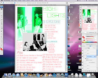
Transforming 'CYCLONE' to make it bigger and more pronounced and also moving it above the description to make it the most important feature.
Blue and red font, same as used on front cover, gives off a distorted effect, so coi-incides with the magazine name.
Black and white photo contrasts the fluorescant green photo, and makes them stand out as the two highlights in the magazine. Large, clear font for p4 and p17, to also make it stand out to the reader
Finished product, having moved the text/images into a good position to make the page easy to read and identify the key points. the use of the colours of bright greens, blues and reds contrast eachother well and give off a distorted image, so they co-incide with the magazine name


No comments:
Post a Comment